Introduction
introduction.RmdThis vignette provides examples on how to use different plotting functions.
Bar chart
mtcars |>
  ggplot(aes(x = factor(cyl),
             fill = factor(am))) +
  theme_RR() +
  geom_bar_RR() +
  labs(title = "Number of Cars per Number of Cylinders",
       x = "Number of Cylinders",
       y = "Count") +
  scale_fill_RR()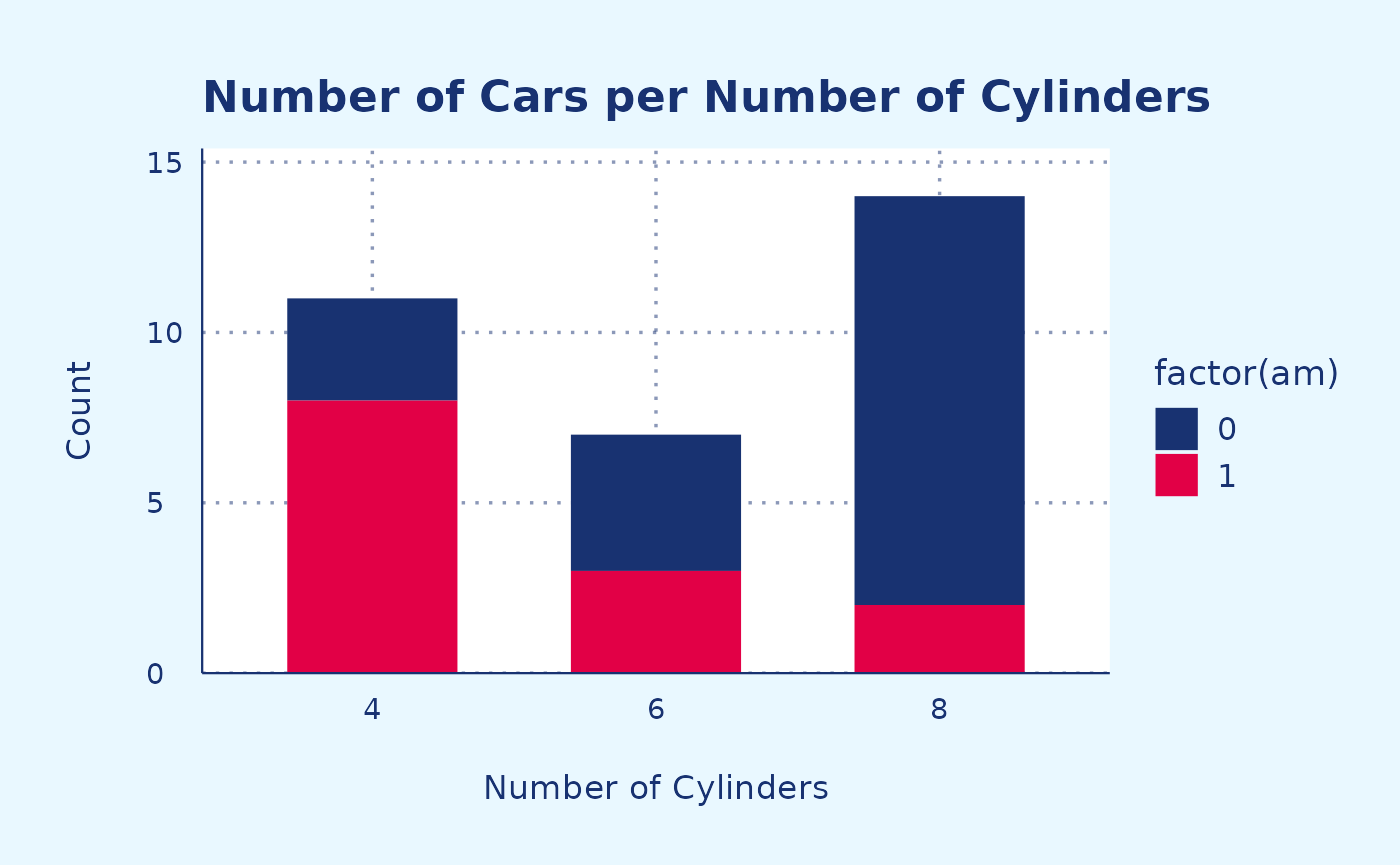
Scatter plot (discrete palette)
Example 1
iris |>
  ggplot(aes(x = Sepal.Length,
             y = Sepal.Width,
             color = Species)) +
  theme_RR() +
  geom_point_RR() +
  labs(title = "Scatterplot of Sepal Dimensions",
       x = "Sepal Length",
       y = "Sepal Width") +
  scale_color_RR()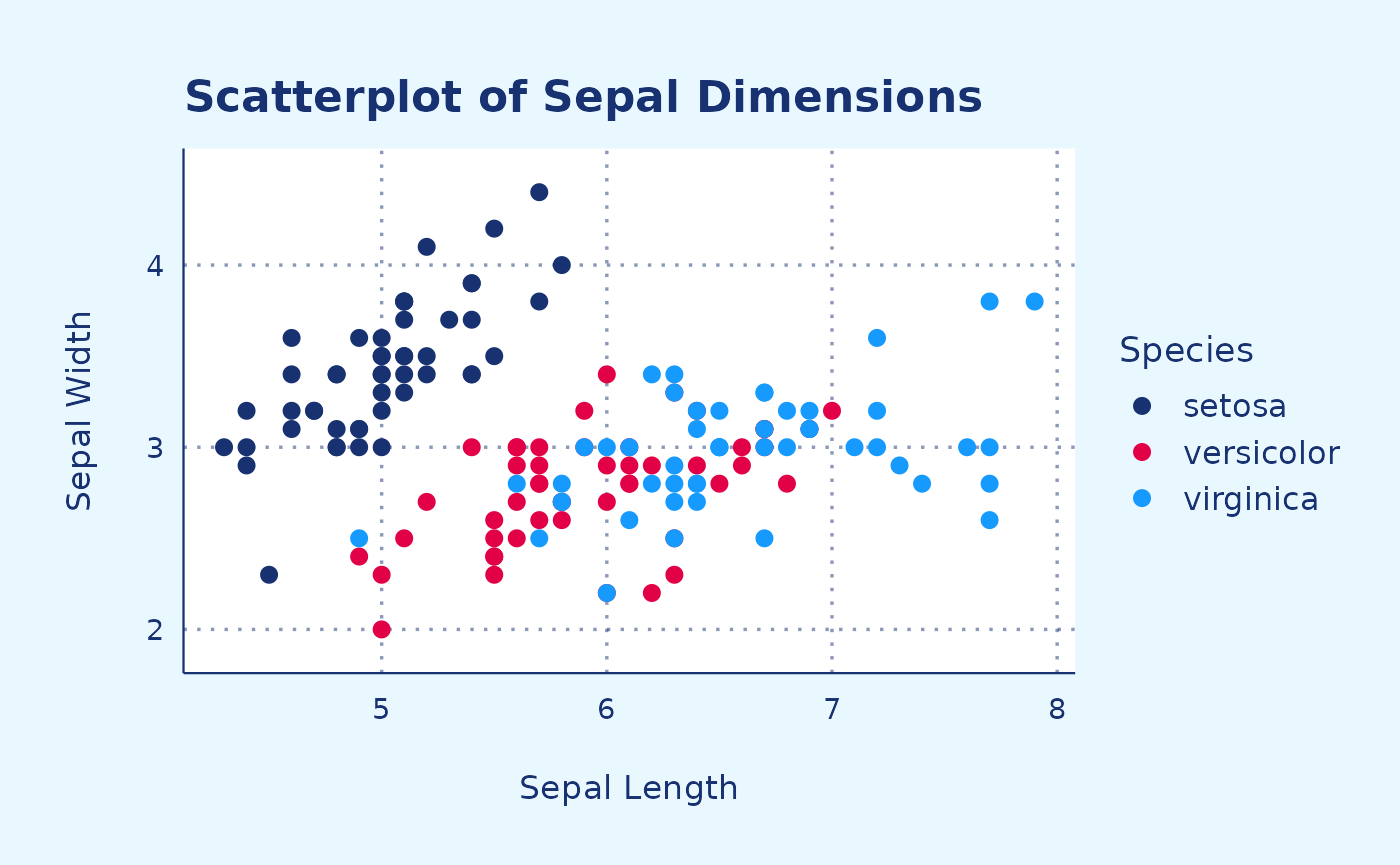
Example 2
mpg |>
  ggplot(aes(cty,
             hwy,
             color = factor(cyl))) +
  theme_RR() +
  geom_jitter_RR() +
  scale_color_RR()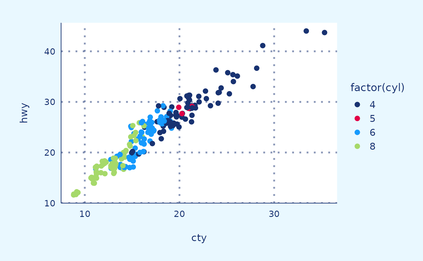
Scatter plot (continuous palette)
Red
mtcars |>
  ggplot(aes(x = hp,
             y = mpg,
             color = cyl)) +
  theme_RR() +
  geom_point_RR() +
  labs(x = "Horse power",
       y = "Miles per gallon",
       fill = "Cylinders") +
  scale_color_continuous_RR_red()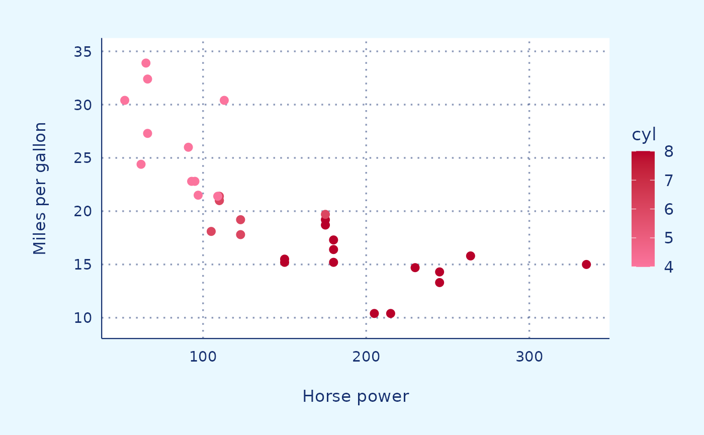
Blue
mtcars |>
  ggplot(aes(x = hp,
             y = mpg,
             color = cyl)) +
  theme_RR() +
  geom_point_RR() +
  labs(x = "Horse power",
       y = "Miles per gallon",
       fill = "Cylinders") +
  scale_color_continuous_RR_blue()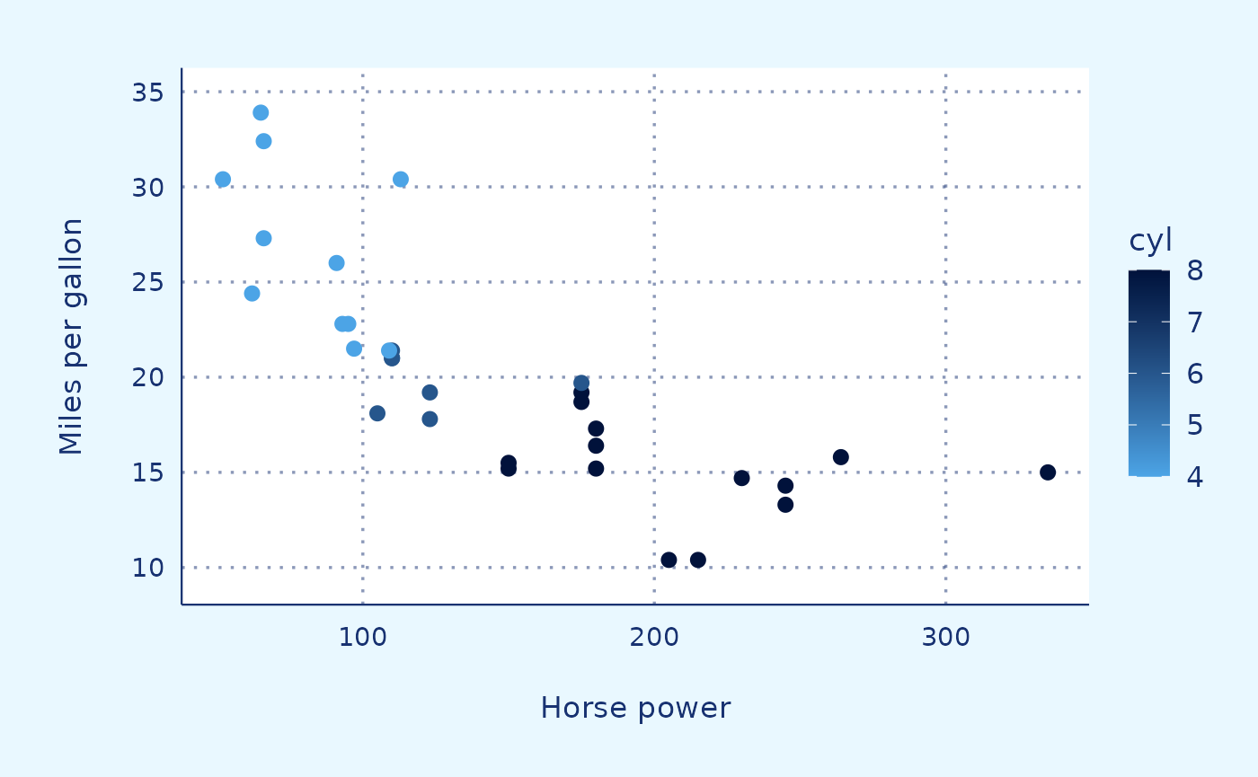
Density plot
# Generate example data
set.seed(123)
data <- data.frame(
  Group = rep(c("Group1", "Group2"), each = 200),
  Value = c(rnorm(200, mean = 0, sd = 1), rnorm(200, mean = 2, sd = 1))
)

# Create density plot
data |>
  ggplot(aes(x = Value, fill = Group)) +
  theme_RR() +
  geom_density_RR(alpha = 0.5) +
  labs(x = "Value", y = "Density",
       fill = "Group") +
  scale_fill_RR()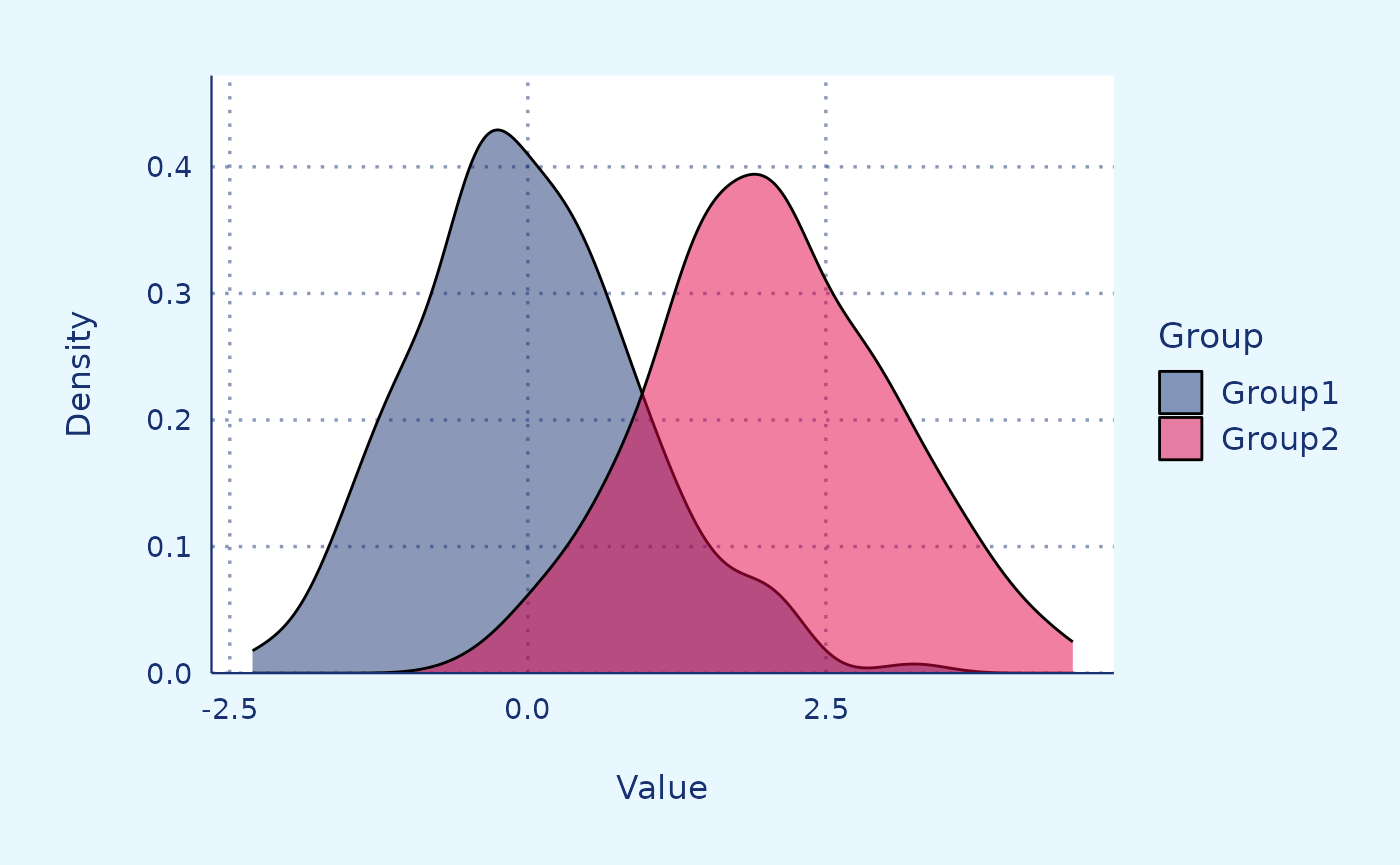
Line chart (simple)
# Load dataset
data("babynames")
data <- babynames |>
  filter(name %in% c("Mary", "Ashley", "Amanda",
                     "Jessica", "Patricia", "Linda",
                     "Deborah", "Dorothy", "Betty")) |>
  filter(sex=="F")

# Plot
data |>
  ggplot(aes(x = year,
             y = n,
             group = name,
             color = name)) +
  theme_RR() +
  geom_line_RR() +
  scale_color_RR()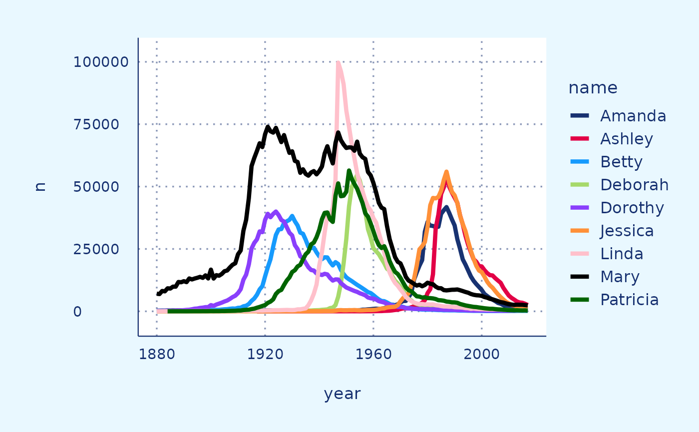
Line chart (faceted)
tmp <- data |>
  mutate(name2=name)

RR_dark_blue <- "#183271"

tmp |>
  ggplot(aes(x = year,
             y = n)) +
  theme_RR() +
  geom_line(data = tmp |> dplyr::select(-name),
               aes(group = name2),
               color = "grey",
               linewidth = 0.5,
               alpha = 0.5) +
  geom_line(aes(color = name),
               color = RR_dark_blue,
               linewidth = 1.2)+
  scale_color_RR() +
  facet_wrap(~name) +
  theme(axis.line = element_blank()) +
  labs(y = "Count",
       x = "Year")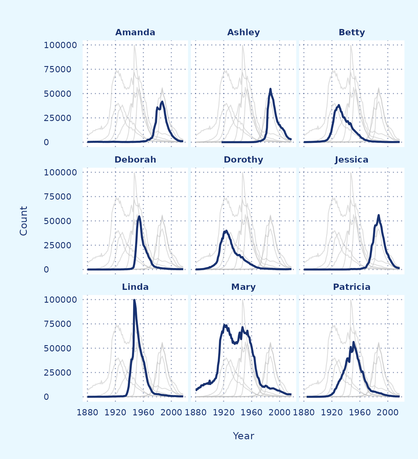
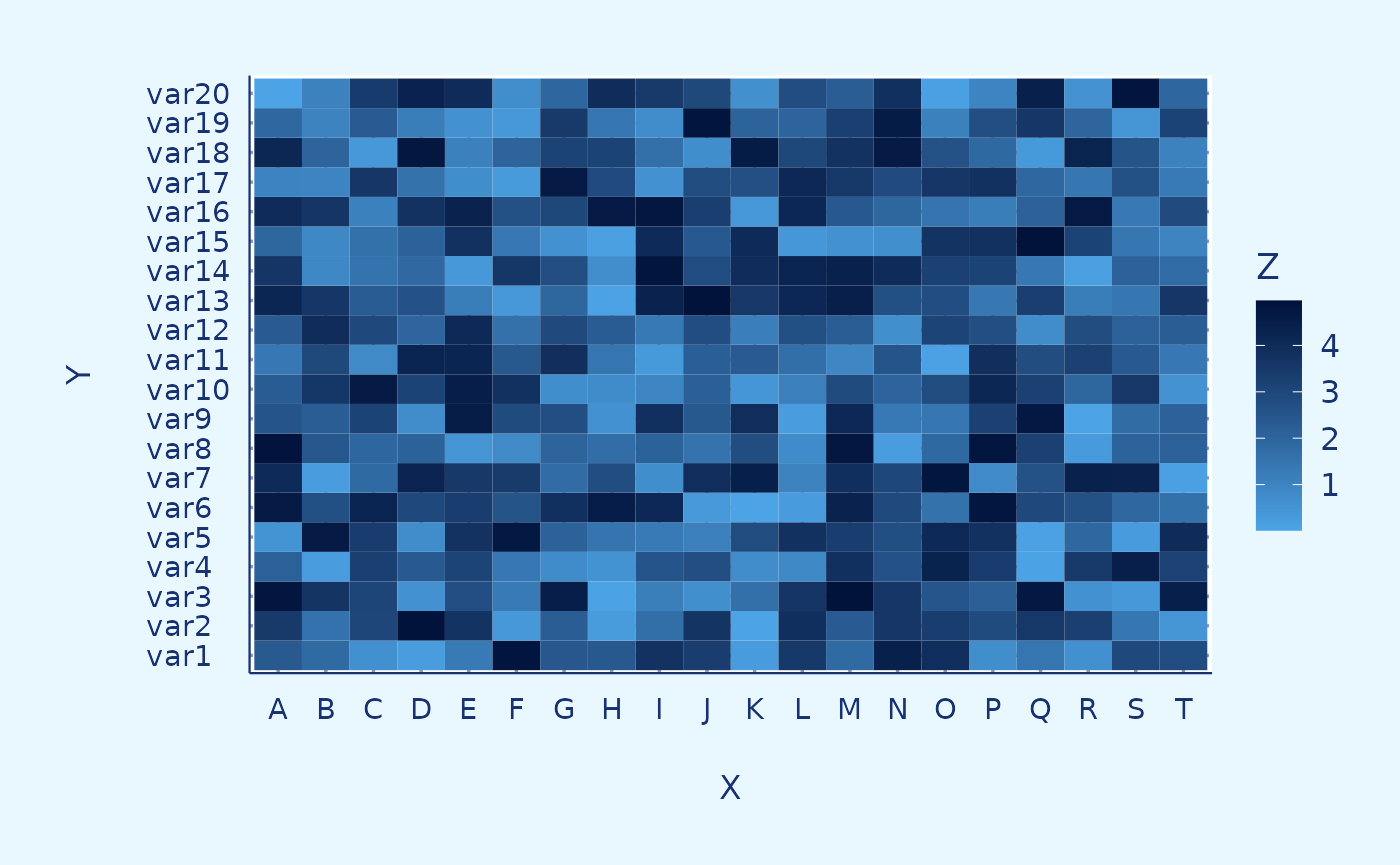
Heat map
Blue
# Dummy data
x <- LETTERS[1:20]
y <- paste0("var", seq(1,20))
data <- expand.grid(X=x, Y=y)
data$Z <- runif(400, 0, 5)

# Heatmap
data |>
  ggplot(aes(X,
             Y,
             fill= Z)) +
  geom_tile() +
  theme_RR() +
  scale_fill_continuous_RR_blue()